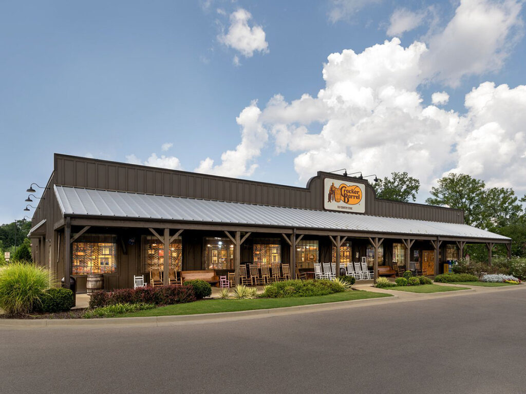
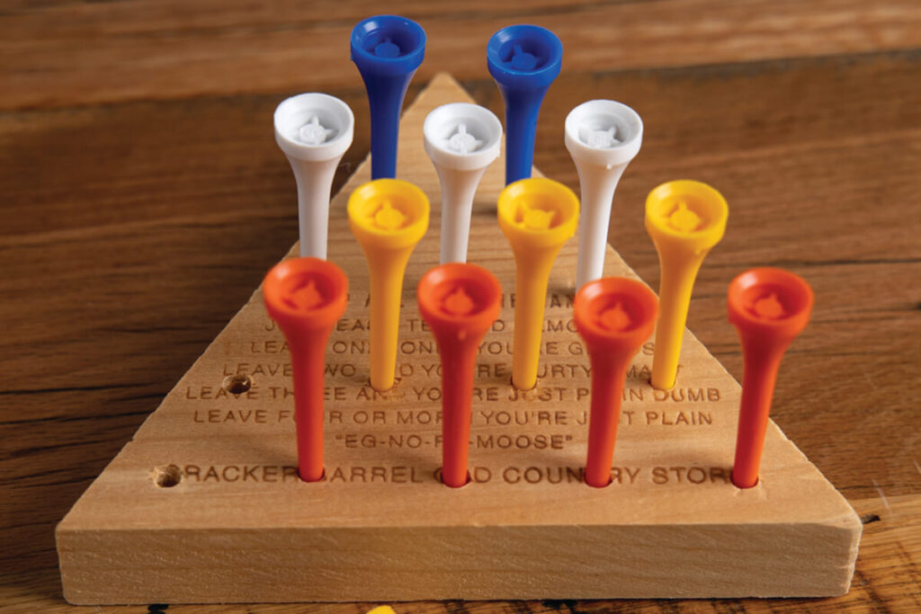
Many of us have been eating at Cracker Barrel for as long as we can remember. We know exactly what to expect when we go there – rocking chairs on the front porch, the old peg game sitting on the table, the smell of coffee and biscuits, and even the man leaning against the barrel in the logo.
So when Cracker Barrel announced they were making changes to the things we are nostalgic about, for many it didn’t feel like progress. It felt like a loss.
According to the company, these changes are meant to keep the brand “fresh, relevant, and true to our values.” Their Chief Marketing Officer explained that the new logo is “rooted even more closely in the iconic barrel shape and word mark that started it all.” They say the goal is to make the stores brighter, easier to navigate, and more modern.

The logic behind the brand and store aesthetic changes would seem to make sense. Businesses need to attract new generations and keep things running smoothly. Lighter walls are easier to clean. Minimalist logos work better in some applications. We get it. However, the strength of the brand has never been logic or efficiency, but on the feelings it evokes of comfort, familiarity, and tradition.
As brand strategists, we believe timing matters. Right now, Americans are in a documented nostalgia era. In a time when artificial intelligence makes us wonder if news, images, voices and videos are real, it is becoming harder for people to trust what they see. People are searching for things that feel solid, trustworthy, and real. Nostalgia matters to them. Even Gen Z says they’re nostalgic for eras they have never experienced. It appears that at a moment when we’re all searching for comfort and connection to what’s real, Cracker Barrel decided to strip away the very things that make it feel real. People are craving what’s familiar, and Cracker Barrel’s old aesthetic was something unchanged in a changing world. Their move toward fresh and modern goes against what surveys show people are craving right now. And this was reflected in the financial impact of the logo launch as well – the company lost almost $100 million in market value immediately following the logo release.
So What Went Wrong?

So why does it feel like we’ve lost a friend with the Cracker Barrel rebrand? It’s simple. The old logo with the man and barrel wasn’t just a logo. It was a symbol of Americana. Replacing it during a nostalgia boom severs an emotional tether and makes Cracker Barrel look like any other restaurant chain along the highway.
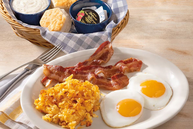
Once you remove the brand equity that comes with a logo and aesthetic like Cracker Barrel had built, you have to over-invest everywhere else to keep the old feeling alive. One way to do this could be to keep the simplified logo for digital and small format use where legibility matters, but re-introduce the heritage logo featuring the man & barrel as the mark on signage, menus, uniform, and in the retail shop. Also, a campaign featuring what we love about Cracker Barrel – hand-rolled biscuits, people rocking on the porch while playing checkers, and friendly staff pouring coffee, could help to solidify the more real and human element of Cracker Barrel’s brand. But this would need to be an ongoing campaign investment to try to recover what they’ve lost by the changes they’ve made.

Brand identity is more than a logo, color palettes, and typography. For heritage brands though, symbols become especially important because they don’t just represent the story, they are the story. Removing it risks weakening hard-earned brand equity and the uniqueness that set the brand apart.
Because in the end, Cracker Barrel’s brand was never about being modern. It was about being timeless. And in an era when so much feels artificial, the decision to hold on to what’s real and to be timeless may be the best decision of all.


